Archive for Statcast

Thoughts on Pulling the Ball

There have been two things somewhat stuck in my head that feel contradictory but maybe aren’t. One is that hitters should pull the ball more to get to more power. The other is that “using all fields” is a time-honored phrase for hitters who benefit by spraying the ball around the park.

Read the rest of this entry »


The Statcast Era’s Home Run Derby

In the past few weeks, guests on the Baseball Tonight Podcast with Buster Olney have gone through the exercise of creating their all-time home run derby list. Obvious finalists such as Babe Ruth, Josh Gibson, Ken Griffey Jr., and Mark McGwire have filled the theoretical brackets. As another season’s All-Star break is upon us, we’ll be graced with a few hours of this year’s big boppers attempting to hit baseballs as far as humanly possible. Though it may be a new format, the goal is the same; hit home runs!

Read the rest of this entry »


Know Your Averages 2024, Four-Seam Fastball Edition

It can be difficult to remember all these numbers. You hear phrases like “Garrett Crochet‘s four-seam fastball has a 15.7% swinging strike rate this season” or “Batters are chasing Cristopher Sánchez’s cutter 50% of the time!” Doing anything in baseball 50% of the time is typically standout behavior. Still, these quick statistical callouts can be hard to process without the baseline, or the average, ingrained in your mind. Luckily, sweet corners of the internet give us the data we need to process the things all these smart baseball people say without having to constantly hit the “-10 sec” button on our podcast episodes.

Read the rest of this entry »


A Way-Too-Early Look at the Importance of Bat Speed

This article takes a look at some of the new bat tracking metrics published this week at Baseball Savant. It aims to help readers incorporate the new metrics into their analysis toolkit.

Bat tracking metrics have now been published for 2024, starting on April 3rd. Last year, Baseball America published a test version of average bat speed as well. The operationalization of the bat tracking metrics has been tweaked since the Baseball America version was published, but so far, this is the data we have to work with.

Read the rest of this entry »


Pitchers Who Pitch to Their VAA

When something becomes sexy, I’m all in. Crocs and socks? Sexy. Minivans with a built-in vacuum cleaner to suck up all the floor Cheerios? Sexy. Throwing a four-seam fastball with a very shallow vertical approach angle due to some serious induced vertical break at the top of the zone? Sexy. Some things some people just can’t pull off. But when a trend becomes a trend, you’re either in or you’re out.

Read the rest of this entry »


The Best pVals in 2023: Offspeed/Breaking Ball Edition

Part one of this installment looked at four-seam fastballs and cutters. Part two analyzed sinkers and splitters. Part three, our final act, will detail sliders, curveballs, and changeups.

Read the rest of this entry »


The Best pVals in 2023: Fastball Edition Part Two

pVals are a topic of debate among pitch-level data masterminds. One side may consider them useless. Good pitches get hit and bad pitches get taken for strikes and pVals don’t explain any of that. On the other side, people like to know what actually happened. If a splitter left in the middle of the zone gets a called third strike when it probably should have been mashed for a home run, then pVals still credit the pitcher. The strikeout is what actually happened.

Keep in mind as you peruse this season’s best fastballs just that; pVals aren’t perfect. You’ll read about Chris Bassitt’s sinker and think, Chris Bassitt is a clear candidate for being drafted, but read on and you may back away from that stance. pVals help us understand what occurred, but take caution when using them to predict what will happen. Confused? Let’s just watch some GIFs.

Part one of this installment looked at four-seam fastballs and cutters. Part two will focus on sinkers and splitters.

Read the rest of this entry »


A Pitch Mechanics Consistency Data Experiment Part II

On July 17th of the 2022 season in Minnesota, Dylan Cease dealt. He threw seven innings, only gave up one hit, and recorded eight strikeouts. His showing left a game score of 83. It wouldn’t be his highest game score of the year (94), in fact, it wouldn’t even be his second-highest (90), but it was a great outing nonetheless. I’m going to use this game as way of continuing my analysis from last week on what we can measure from a pitching mechanics standpoint using statcast pitch-level data. Like in last week’s post, I took the following variables from Cease fastballs on that great start, July 17th:

‘release_pos_x’, ‘release_pos_z’, ‘release_spin_rate’, ‘release_extension’, ‘spin_axis’

I then conducted a principal component analysis in order to bring these five columns of data down into two. That allows me to then plot the data points on a scatter plot like so:

Cease 7/17/23 PCA Scatter Plot

The graph above shows two principal components of all of Cease’s fastballs thrown on July 17th. I am interested in understanding if the spread, or variance, of these data points, relates in any way to performance. A helpful suggestion from FanGraphs member, “couthcommander” came in last week’s post:

“[C]an you…change the point-character shape based on inning?”

Cease 7/17/23 PCA Scatter Plot By Inning

I chose a slightly different route and changed the color of the points based on the inning. I was expecting to see the darker points (later innings) on the outer edges of the scatter plot and lighter points (earlier innings) tighter around the center, but it’s hard to notice much of a pattern from this one game. Let’s visualize it in a different way. Rather than directly plotting the two principal components as X and Y, I calculated the variance of each by inning and compared the two components:

PCA 1 and 2 Variance by Inning Bar Chart

Click to enlarge


The first principal component shows higher variance as the game goes on through the fourth inning, but then comes back down for the fifth and seventh. A similar pattern is shown in the second component but only through inning two. The variance in PCA2 jumped in inning five but came back down in inning seven. No fastballs were thrown in inning 6.

It’s important to remind ourselves of what we’re actually looking at here. PCA1 finds a new axis of variation in this multi-dimensional dataset. Imagine a straight line being drawn through a multi-dimensional scatter plot. This new “principal component” does its best job of explaining as much of the variability in the dataset as possible. By that logic, PCA1 is just a little more informative than PCA2. The bar chart is telling us that as the game increased, that component become more variable through the fourth and then stabilized in the fifth. But remember, this is only explaining the following:

‘release_pos_x’, ‘release_pos_z’, ‘release_spin_rate’, ‘release_extension’, ‘spin_axis’

So the question is, does it matter? Does the variance of a component measure of these five features correlate with success? We can look at the components of Cease’s start before and after the great July 17th start.


–July 12th @ CLE: Game Score 66–
PCA1 = 3.3
PCA2 = 0.3

–July 17th @ MIN: Game Score 83–
PCA1 = 1.8
PCA2 = 0.3

–July 24th VS CLE: Game Score 63–
PCA1 = 2.1
PCA2 = 0.2

Variance = STD(PCA)^^2 x 10,000


While this is in no way conclusive evidence, it’s a start. The variance of PCA1 was lowest on July 17th. The next step in this analysis, as always, is to bring in more data! I will work towards answering the question, does a low variance PCA1 or PCA2 correlate with better performance? If it does, fantasy managers could use this information, if it is tracked and made available, to determine hot spots in a season where pitchers are locked-in. Thanks for participating in this data journey with me. We’ll see where it takes us.


Launch Angles, Release Points and Hit Predictability

Through games played on June 23rd, 2022, Luis Arraez held the highest batting average in the MLB at .349. He was just ahead of Paul Goldschmidt (.340), who was in the midst of putting together a career year, and Xander Bogaerts (.335), who was just being Xander Bogaerts. So, if you had chosen a player that you thought was most likely to get a hit the following day, June 24th, any of those three players would have been a safe bet. But, it’s just not that simple, is it? Goldschmidt played the next day but went 0-4. Arraez played and went 0-4. Bogaerts didn’t play. And that really is the challenge in trying to predict something like who will get a hit each day. That’s why there remains a $5.6 Million jackpot on the line.

I’ve written about my ventures in using analytics and a predictive model (Jolt) to help with daily batter hit predictions while playing in the Beat the Streak contest. You can learn more about the contest here, you can listen to a podcast about it during the season and you can sign up to the play game yourself! I won’t write much about the specifics of the contest, but it is the motivation for this research. The general idea is that you choose a player each day that you think will get a hit, if he does, you get a point, if he doesn’t, you go back down to zero. The goal is to reach 56. But, strip away the millions, strip away any contest or fantasy-style game, and what we’re left with is the question of how to best predict the next day’s hitters.

Jolt, the name of the model I’ve built to aid in making this prediction and a tribute to “Joltin” Joe DiMaggio, was built on the concept that the launch angle and launch speed of the hitter matter tremendously. Since we know that certain launch angles are more likely to lead to a hit and that balls hit hard also add to that likelihood, we can look for players who do that type of thing often. To show this in a visualization I randomly sampled a few days’ worth of savant batted ball data for each month of the 2022 season, sub-set that data down to only looking at batted balls from four-seam fastballs, and looked at the distribution of hits versus non-hits:

Launch Angle Distributions - Hits vs. Non-Hits

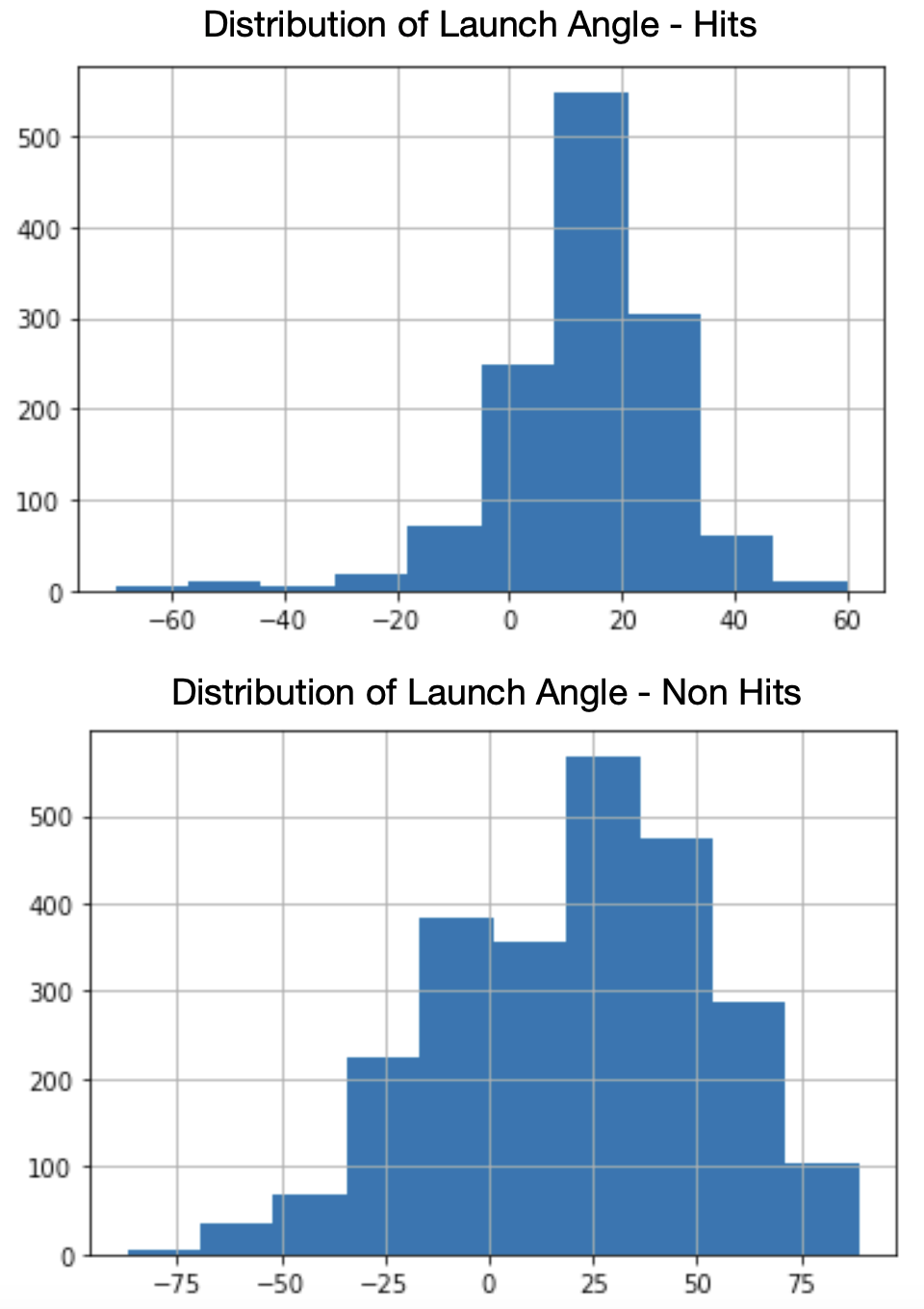
In this sample of data, batted balls (this does include home runs) ended in hits much more often with launch angles between, roughly, 10 and 20 degrees and that is something we have known for a while now. Balls launched at these angles have a much higher likelihood of being line drives and therefore, more difficult for fielders to get to. Let’s use this information and go back to June 24th. Through games played on the 23rd, there were eight hitters right in that solid average launch angle of 18 degrees bin. Here they are along with their up until that point batting average and June 24th results:

Hit Results 6/24/22, Mid Average LA
Name LA AVG 6/24/22
Mike Yastrzemski 18.8 0.250 1-4
Will Smith 18.8 0.256 2-5
Justin Turner 18.8 0.220 0-4
Ha-Seong Kim 18.8 0.226 1-3
Christian Walker 18.5 0.208 1-4
Cedric Mullins II 18.4 0.248 1-4
Marcus Semien 18.2 0.228 2-5
Mookie Betts 18.1 0.273 0-0
*Among qualified hitters with a 18 degree average launch angle through 6/23/22

Yahtzee! Is it really that easy? Just pick the hitter who has been to the plate a lot and has a level, hit-falling average launch angle? You might think this is basically the same as selecting line-drive hitters, but it’s not. At least, those two measurements aren’t showing the same hitters. Only Will Smith found himself in both the group of players above and in the top 20 qualified hitters by line-drive percentage. The funniest part about this sample of hitters is that the hitter with the highest batting average, Mookie Betts, is one of only two players to not get a hit the following day. This is random of course. But, just for kicks, let’s do it with hitters who had been putting the ball on the ground (5 degrees) too much through June 23rd and look at how they did on the 24th:

Hit Results 6/24/22, Low Average LA
Name LA AVG 6/24/22
Yandy Díaz 5.1 0.263 0-4
Nicky Lopez 5.1 0.217
Vladimir Guerrero Jr. 5.3 0.264 2-5
Miguel Cabrera 5.7 0.299 1-4
Juan Soto 5.8 0.214 1-4
*Among qualified hitters with a 5 degree average launch angle through 6/23/22

Ok, theory killed? Clearly you can see from the histograms that while a launch angle in the 10 to 20 range falls for a hit more often, there are a lot of other launch angles that fall for hits too. Those same launch angles don’t fall for hits as well. While finding players who have a tight launch angle, Alex Chamberlain style, would be a good strategy, you would likely find yourself choosing the same handful of hitters every day, thus limiting your player pool. Just look at Paul Goldschmidt’s 2022 cumulative average launch angle:

Goldschmidt Cumulative LA

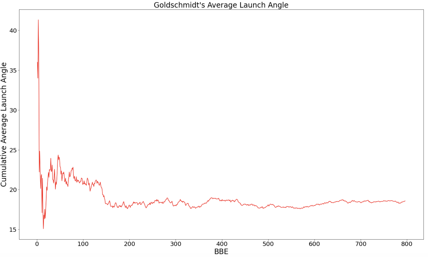
It becomes fairly stable around BBE number 200. Choosing Goldy every day would have been a good strategy in 2022, but for obvious reasons wouldn’t allow you to string together 56 consecutive hits and that’s the name of the game. It would also fail to take into consideration who was throwing the ball, which is arguably 50% (but probably more) of the equation. Jolt’s first iteration sought to find players with good launch angles matching good release points. The thinking was that high release points translate to higher approach angles and that uppercut swings bring the bat through the zone on those particular pitches longer. It’s not a new concept in baseball. Ted Williams’ 1986 book, The Science of Hitting, detailed some of this thinking.

It was even backed up by the model’s validation. Jolt, iteration one, found ‘release_pos_z’, or the “vertical release position of the ball measured in feet from the catcher’s perspective” according to baseball savant, as the fifth most important variable in predicting a hit out of all of statcast’s outputs. Unfortunately, this is much, much more descriptive than it is predictive. A trained model will say that the launch angle of a batted ball and the release point of the pitch help “predict” whether the ball falls for a hit or not. While a release point, especially if you isolate to single pitch like just a fastball, can be predicted, you can’t really predict at which angle the ball will be hit before the batter swings. Here’s an example:

Release Pos Z vs. LA Scatter Plot

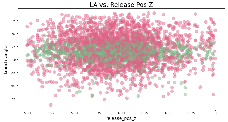
In this image, green represents hits in the data and red represents non-hits. The green band going across the chart tells us just how important the launch angle is, but it doesn’t have a relationship with the release point of the pitch. Any of these release points can match up with any of these launch angles and fall for a hit. It is uncommon for any launch angle above ~70 degrees to fall for a hit, but there may be a few outliers in there. Regardless, matching up a pitcher’s release point with a batter’s launch angle doesn’t seem to provide much detail when analyzing this data. Most of us would completely disagree with the data in this case, but it doesn’t mean that hitters are actively upper-cut swinging on high-released fastballs because I would imagine, that’s friggin’ impossible to do. But maybe it naturally happens? Maybe looking at it from a vertical approach angle (VAA), the angle of the ball as it crosses into the zone, is the better…um…approach? Let’s see:

LA vs VAA (FA)

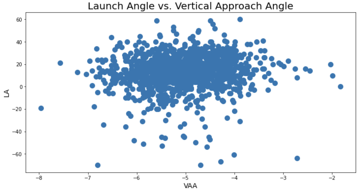
This graph would tell you that besides the outliers, all VAAs can be hit with all LAs. Again, there is a HUGE discrepency between what we computer baseball nerds see and read and think and what a hitter actually does. If there are any hitters out there who know that tomorrow’s starting pitcher has a very steep vertical approach angle, are they altering their swing or approach to match it? Um…I’ll guess…no. It’s hard enough for them to decide to swing or take. But there must be somethign I’m missing. The launch angle in which a ball that falls for a hit is struck may not necessarily relate to how high the pitcher is releasing the ball, but certainly, some swing types are better against those pitches than others. But what is measuring that? What is measuring the actual swing? There have been some attempts made like the data collected by Swing Graphs, but nothing that I’ve seen is freely available to the public.

A model, whether it has a good R-squared, average-squared error, misclassification rate, or get-a-lot-of-likes-on-twitter rate, doesn’t do a good job of telling us whether a certain launch angle will be more successful against a certain vertical approach angle because it’s just too random and there’s too much noise. It’s also too difficult to create that data before it happens in order to make predictions on it. But, Jolt simply won’t quit. Iterations continue and there remains work to be done to better model tomorrow’s hit likelihood. In fact, MLB does it for its Beat the Streak app. But, no one has found success in just picking the top-recommended hitter each day, have they? Of course, I’m not implying that a model will be the only way to win this contest, in fact, I don’t think one single person will ever be able to win this contest. However, sometimes a simple model coupled with logical thinking and sound judgment is best. Jolt’s next attempt will focus on that. Just look at the table of June 24th’s outcomes at the top of this page and you’ll see, there’s something to just choosing who is hot each day and who works well against the guy standing on the mound.


Somedays You Have It And Somedays You Don’t: Robbie Ray’s Slider

Troy Taormina-USA TODAY Sports

It has always been difficult for me to understand pitcher volatility. Well, the volatility part isn’t hard to understand, actually, it’s very simple. Pitching in the big leagues is incredibly difficult and one tiny little element of a pitcher’s game could be off to make the whole outing unravel. But, what is hard to understand is what little element that is. Did a 1 mph drop on a four-seamer really make it all go south? Or, was it a matter of half an inch of location? Is it even measurable? Like, what if it was just bad gas from the previous night’s chimichanga that threw things off? Do you see where I’m going? I want to know why a pitcher does so well one day and so poorly the next. For my first round of this, I’ll start slow and focus on only one pitch, narrowing the question down to, why does one pitch perform well one day and bad the next? In today’s investigation, I’ll analyze and compare Robbie Ray’s July 3rd 2.6 wSL Pval (Pitch Info) with his July 24th -3.4 wSL pVal. Let’s have some fun.
Read the rest of this entry »