A Pitch Mechanics Consistency Data Experiment Part II
On July 17th of the 2022 season in Minnesota, Dylan Cease dealt. He threw seven innings, only gave up one hit, and recorded eight strikeouts. His showing left a game score of 83. It wouldn’t be his highest game score of the year (94), in fact, it wouldn’t even be his second-highest (90), but it was a great outing nonetheless. I’m going to use this game as way of continuing my analysis from last week on what we can measure from a pitching mechanics standpoint using statcast pitch-level data. Like in last week’s post, I took the following variables from Cease fastballs on that great start, July 17th:
‘release_pos_x’, ‘release_pos_z’, ‘release_spin_rate’, ‘release_extension’, ‘spin_axis’
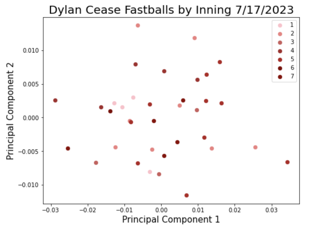
I then conducted a principal component analysis in order to bring these five columns of data down into two. That allows me to then plot the data points on a scatter plot like so:

The graph above shows two principal components of all of Cease’s fastballs thrown on July 17th. I am interested in understanding if the spread, or variance, of these data points, relates in any way to performance. A helpful suggestion from FanGraphs member, “couthcommander” came in last week’s post:
“[C]an you…change the point-character shape based on inning?”

I chose a slightly different route and changed the color of the points based on the inning. I was expecting to see the darker points (later innings) on the outer edges of the scatter plot and lighter points (earlier innings) tighter around the center, but it’s hard to notice much of a pattern from this one game. Let’s visualize it in a different way. Rather than directly plotting the two principal components as X and Y, I calculated the variance of each by inning and compared the two components:
Click to enlarge
The first principal component shows higher variance as the game goes on through the fourth inning, but then comes back down for the fifth and seventh. A similar pattern is shown in the second component but only through inning two. The variance in PCA2 jumped in inning five but came back down in inning seven. No fastballs were thrown in inning 6.
It’s important to remind ourselves of what we’re actually looking at here. PCA1 finds a new axis of variation in this multi-dimensional dataset. Imagine a straight line being drawn through a multi-dimensional scatter plot. This new “principal component” does its best job of explaining as much of the variability in the dataset as possible. By that logic, PCA1 is just a little more informative than PCA2. The bar chart is telling us that as the game increased, that component become more variable through the fourth and then stabilized in the fifth. But remember, this is only explaining the following:
‘release_pos_x’, ‘release_pos_z’, ‘release_spin_rate’, ‘release_extension’, ‘spin_axis’
So the question is, does it matter? Does the variance of a component measure of these five features correlate with success? We can look at the components of Cease’s start before and after the great July 17th start.
–July 12th @ CLE: Game Score 66–
PCA1 = 3.3
PCA2 = 0.3
–July 17th @ MIN: Game Score 83–
PCA1 = 1.8
PCA2 = 0.3
–July 24th VS CLE: Game Score 63–
PCA1 = 2.1
PCA2 = 0.2
Variance = STD(PCA)^^2 x 10,000
While this is in no way conclusive evidence, it’s a start. The variance of PCA1 was lowest on July 17th. The next step in this analysis, as always, is to bring in more data! I will work towards answering the question, does a low variance PCA1 or PCA2 correlate with better performance? If it does, fantasy managers could use this information, if it is tracked and made available, to determine hot spots in a season where pitchers are locked-in. Thanks for participating in this data journey with me. We’ll see where it takes us.


Cool stuff. What are the weights for PC1 and PC2? Would be interesting to see which of those five variables they’re picking up on and how