Hitter Rookie Review — May 19, 2022
May 19, 2022
Yesterday, I reviewed three rookie hitters, all of whom happened to be top five prospects heading into the season. Let’s review another three today using the same format.
Yesterday, I reviewed three rookie hitters, all of whom happened to be top five prospects heading into the season. Let’s review another three today using the same format.
I can’t remember the last time three of the top five prospects all debuted at the same time. Has it ever happened? I’m sure at some point in history, but it’s pretty awesome. This season, the #2 overall prospect Bobby Witt Jr., #4 prospect Julio Rodríguez, and #5 prospect Spencer Torkelson all opened the regular season in their teams’ starting lineups. Exciting! With just over a fifth of the season in the books, let’s take a gander at how these potential future stars are performing.

Mike Trout, Yordan Alvarez, Aaron Judge, and… J.D. Davis? As of this writing (5/14/22), Davis is fourth on the Statcast expected stats leaderboard behind three of the best sluggers in baseball. Sure, he has about less than half of the plate appearances (62) as those other three (average of 124), but his .454 xwOBA is bright red nonetheless. Sadly, Davis is only slugging .300. Compare that with Yordan Alvarez’s .697, and you wonder why I’m mentioning Davis and Alvarez in the same paragraph. Somehow, Alvarez is actually expected to be slugging even higher, .082 points higher to be exact. Davis? He’s expected to be slugging .313 points higher, or a total of .613. Davis holds the largest difference between his wOBA (.301) and his xwOBA (.454) among hitters with enough balls in play to qualify for the leaderboard. Ladies and gentlemen, the man has been getting robbed and I give you the first example:
That ball was struck at 102 mph at an angle of 14 degrees. The estimated batting average by Statcast’s combination of hit speed and angle was 0.714. While there was an infield shift on, the outfield alignment is listed as “Standard” in the data. But you don’t have to drill into any data at all after watching the video to realize the ball was smoked, it was just smoked right at an outfielder.
Yesterday, I looked at the hitter maxEV surgers versus last year. For this comparison, 2022 sample size doesn’t matter, as the smaller number of at-bats makes it that much more impressive that the hitter has already exceeded his 2021 maxEV. Today, we flip to the maxEV decliners. This time, sample size does matter, as hitters clearly had more opportunity to launch that one ball that marked their maxEV last year than this season so far. So take these names with a larger grain of salt and don’t panic nearly as much given the sample size issues. An appearance here could prove to be meaningless, or it could be nothing, and tomorrow the hitter hits that one ball hard enough to move that maxEV up.
Let’s talk hitter maxEV, which represents the highest exit velocity recorded by a hitter during the season. It could come on any batted ball type, though a high EV on a fly ball, or even line drive, is much more meaningful than on a grounder. Today, I’ll review the hitters whose maxEV marks have already surged versus 2021. The beauty of focusing on the surgers is that we don’t care about sample size this year. Last year, sure, sample size matters. The greater the sample size of balls in play, the better chance the hitter has of exceeding any particular EV. So the thinking goes that if a hitter has already exceeded his mark last year in just a month and change of balls in play, it could mean his power has increased. Let’s get to the names.
This past weekend, I was trying to decide how much to lean into Oakland’s nine-game week. I didn’t know if just the regulars would start in all the games or should I focus on some of the lesser bats (there are many of them on Oakland). I figured this question would come up several times during the season, so I decided to get an overall view of who sits and plays.
I’ll apologize upfront for most of the article being a big data dump. If anyone is not interested in the numbers, just jump to “Conclusions” for my take on the information. Read the rest of this entry »
Yesterday, I reviewed the hitters who have underperformed their xwOBA marks the most. Now let’s flip over to the overperformers. Once again, I acknowledge the flaws in the metric and the existence of consistent underperformers and overperformers. If one of the hitters on this list has consistently overperformed, I’ll note it.
Let’s begin with a nice oppo example from this past Sunday’s game in Philadelphia, where the Phillies took on Max Scherzer and the Mets:
A young Bryson Stott stays through the ball and knocks in an RBI by going oppo. In last week’s post, I built a model that combined data from our batted ball, statcast, and plate discipline leaderboards for a single point in time in the 2021 season, and used those metrics to target whether or not (a 0/1 binary target variable) a batter recorded a hit the following day. While I pointed out that there was just too little data training the model I was using, I did think it interesting that Oppo% was the most important variable when predicting a hit. Was I on to something? Is predicting a hit as simple as looking at who goes oppo the most?
You and I both know there’s nothing simple about getting a hit, but Oppo% seems like an important statistic when we’re talking about singles. In one of my favorite offbeat fantasy baseball games, Beat The Streak, players must choose one player each day to get a hit and do that successfully for 56 days in order to win a Scrooge McDuck fortune ($5.6 mill). So, this week’s post is all about Oppo%; what it means, what it tells us about a player’s ability to record a hit, and if we can really use it to build out our own swimming pool of gold coins. So let’s take a good look at Oppo% and what it might mean for predicting a hit. Here are your current oppo leaders (qualified hitters) along with their batting average, BABIP, and slugging so far this season:
| Name | PA | Oppo% | AVG | BABIP | SLG |
|---|---|---|---|---|---|
| Yoshi Tsutsugo | 92 | 42.1% | 0.203 | 0.250 | 0.270 |
| Myles Straw | 127 | 38.9% | 0.255 | 0.311 | 0.327 |
| Willson Contreras | 100 | 38.8% | 0.279 | 0.328 | 0.477 |
| Sheldon Neuse | 104 | 38.8% | 0.305 | 0.415 | 0.411 |
| Seiya Suzuki | 111 | 37.1% | 0.247 | 0.328 | 0.473 |
| Nicky Lopez | 91 | 36.9% | 0.221 | 0.266 | 0.260 |
| J.D. Martinez | 92 | 36.5% | 0.294 | 0.367 | 0.518 |
| Randal Grichuk | 96 | 36.5% | 0.281 | 0.356 | 0.449 |
| Aaron Hicks | 87 | 35.3% | 0.250 | 0.327 | 0.294 |
| Freddie Freeman | 119 | 34.9% | 0.317 | 0.349 | 0.515 |
| MLB Average | – | 24.6% | 0.233 | 0.282 | 0.371 |
Each one of these hitters, besides Tsutsugo and Lopez, is hitting above league average according to batting average and BABIP. Remove the two hitters already mentioned, remove Hicks and Straw, and everyone left is slugging above average. This is a good group of hitters. But, I don’t know that beyond Freeman and J.D. Martinez I would be trusting anyone from this group with all my gold coins. In other words, I wouldn’t feel confident in making my daily hit prediction by sorting descending on Oppo%…yet.
As always, people will shout, it’s not enough data! They’re right, but they don’t need to shout. This issue was present in my model from last week’s post. Just a snapshot of one day in baseball doesn’t do the full game justice. I went back and added more data to the model I built previously (still not enough, but we’ll call it “improved”) and Oppo% decreased in importance, but stayed in the mix as an important variable to consider when predicting a hit.
With a larger dataset, the higher feature importances were taken over by things like HardHit%, Barrel%, maxEV, and LD%, which we should expect. In fact, for those who read last week’s post, here is an updated feature importance chart for the same model with more data to train on:
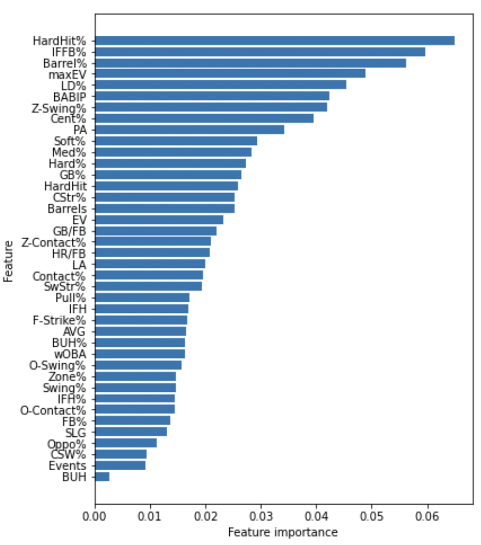
This isn’t as interpretable as a regression model. A random forest creates lots of little decision trees that act as voters to make predictions. Therefore, the model can be difficult to interpret, because you would have to go look at all the little trees being built to get a full picture of how the predictions are being made. In this example, you can see that HardHit% is the first most important feature and IFFB% is the second most. But good hitters should look to hit the ball harder and pop up in the infield less, yet their importances are measured almost equally? That’s because hitting in-field fly balls is just as bad for your hit-ability as hitting the ball hard is good for your hit ability. The 0.06 feature importance isn’t all that interpretable without that background knowledge. We know it’s important, but what does important mean? Furthermore, if we’re trying to figure out how important Oppo% is to a batter getting a hit, more data tells us that it is less important. What the heck does that mean?! Whoaaa! Relax. Take a breath. Watch this video:
While going oppo is no longer as important in a model with a larger dataset, I still see its importance, don’t you? Instead of worrying about fancy models and sample sizes, let’s just take a moment to look at Oppo% in the context of the 2021 season. Here’s a breakdown of batted ball data from the 2021 full season with a 170 PA threshold and how hard, medium, or soft the balls were hit:
| Soft | Med | Hard | BABIP | |
|---|---|---|---|---|
| Oppo | 24.4 | 52.8 | 22.8 | 0.300 |
| Pull | 12.6 | 50.3 | 37.1 | 0.282 |
| Cent | 15.2 | 51.7 | 33.1 | 0.296 |
Opposite hit balls in play were hit softly more often, hit hard less often, but had a higher BABIP than both pulled and centered balls in play. Wild! Want more? How about adding in a little contact type data:
| LD | GB | FB | |
|---|---|---|---|
| Oppo | 21.6 | 21.5 | 56.9 |
| Pull | 20.5 | 57.7 | 21.8 |
| Cent | 20.2 | 41 | 38.8 |
…but sometimes, this happens:
What is most highly correlated with Oppo%? BABIP for the win! A correlation of 0.4 doesn’t make you want to run to pick Yoshi Tsutsugo every day, but it is interesting nonetheless. A small negative correlation with SLG seems strange, but perhaps that’s because unless you drill the ball down the line, chances are your opposite-field hit won’t get you a ton of extra bases.
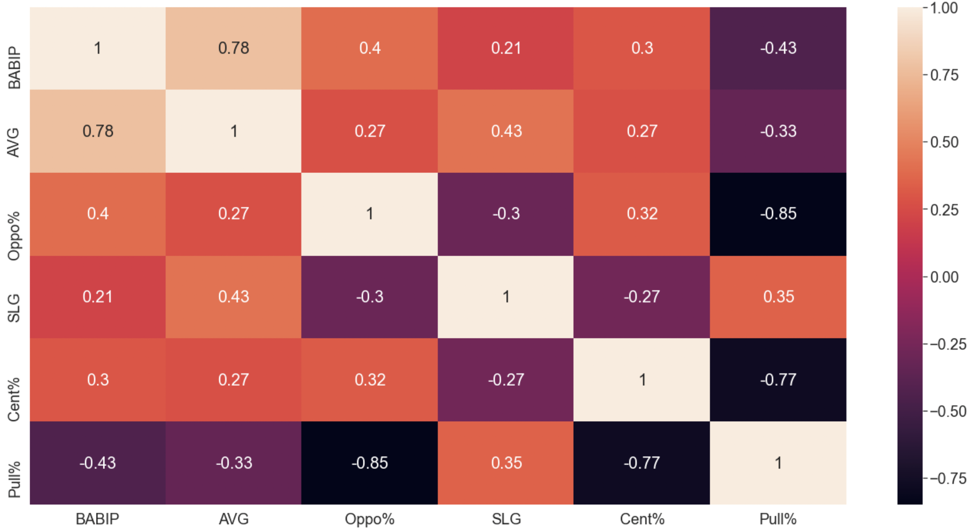
Don’t stare at the correlation chart for too long or you may never get up from your desk chair. Let me instead steer your focus to another table, showing production by contact type:
| SLG | ISO | wRC+ | |
|---|---|---|---|
| Cent | 0.423 | 0.125 | 107 |
| Oppo | 0.452 | 0.135 | 120 |
| Pull | 0.588 | 0.267 | 163 |
Contradictory to what the correlation chart makes us believe when looking at the negative correlation between Oppo% and SLG, it looks like so far this season Oppo% are better for slugging than center struck balls in play. My hypothesis about balls knocked down the line driving those extra-base hits stands. Here’s an example:
As opposed to this ball hit right up the middle into a strategic defensive alignment:
Somehow, we’ve made it this far without talking about the shift, but I won’t dive into that today. Clearly, it must have an impact. If a pull shift is on and a hitter goes oppo, that’s great. But it’s not necessarily the norm. Wander Franco leads the league in hits when going oppo against a traditional shift with 12. He has 38 hits in total.
So does anything that I’ve laid out here today help us understand if going oppo more often brings in more hits? Not really. One of the biggest reasons for that, I believe, is that the league adjusts. If you beat the shift too many times, you stop getting shifted on and it’s harder to get a soft, oppo hit. To drive this point home, I used the same data that built out my feature importances on a more standard logistic regression model. I controlled for multicollinearity (which I know FanGraphs readers love) and passed in the resultant variables, again, targeting a binary hit or not hit variable and Oppo% was found to have a p-value of 0.485 making it above a 0.05 threshold and therefore an insignificant predictor. The variables that were found to be significant? Zone% and EV.
So, today (or maybe tomorrow), when you go to make your Beat The Streak picks, don’t bank on hitters who go oppo. Just try to enjoy the visual that comes from a hitter going oppo. Instead, look for players who barrel and hit the snot out of the ball, and who get pitches in the zone. But, then again, doing something like this will play:
In the last two days, I reviewed league average hitting and pitching metrics to understand what was driving the decline in offense. Now let’s return to discussing individual players. We know that Statcast’s xwOBA has its flaws, as most (all?) estimator metrics do. But it’s the best we have and it doesn’t need to be perfect to provide us with actionable information. Furthermore, we have historical data, so when we see a hitter consistently underperforming or overperforming, we could reasonably conclude that the metric is not accounting for something and ignore the player’s placement on the list.
We’re about a month into the season (holy cow, seriously, it’s whizzed by so far!), and offense is down at levels we haven’t witnessed in a loooooong time. So I’m going to take a break from my usual player specific leader and laggard boards and review some leaguewide metrics. You may have noticed in your fantasy league standings that pitching ratios are significantly better than we’re used to. In my shallow 12-team mixed league, four teams are sitting pretty with a sub-3.00 ERA! Two teams have a sub-1.00 WHIP (I’m barely above at a 1.0057)…whaaaaaaaaaaat?! Even in my AL-Only Tout Wars, four teams have posted a sub-3.00 ERA, which is just insane! Naturally, these strong pitching results must mean that offense has been missing. Let’s review some of the most basic of metrics to find out what’s driving the decline in offense.