MLB Draft Data: Part One
The popularity of amateur drafts in sports has been rising for at least the last decade or so. Just take the NFL draft that used to be a Saturday and Sunday event that now begins primetime Thursday, where people have draft parties and events based around the NFL draft. Think about that for a moment. No sport is being played and no athletes are competing live. People are spending countless hours preparing for an event where players are just being selected. During this time, everybody is a college football and draft expert and lead on to knowing more than the so-called “experts.”
The MLB amateur draft is not quite at that level yet, but the fact that it is now televised is interesting in terms of how quickly the popularity of the MLB draft is, or at least how popular major league baseball wants to make it. I’m fascinated how much stock people take in the draft considering most people have never really watched these players in high school or college, so the general public really has no clue who these guys are, unlike college football where a lot of these players were watched by a large audience every Saturday, whether it was active or passive watching.
This brought up some curiosity on my part. Thanks to Jeff Zimmerman, he did a tremendous job of providing me all the data I needed to start exploring my curiosity into the MLB draft using a great data visualization tool, Tableau Public. I didn’t have an exact idea about what I wanted to learn. I just wanted to explore the MLB draft from the beginnings to now. I had no preconceived notions, I just wanted to see if there were any trends I could find/or not find based on the data. So I plugged the data in and began looking around. I found some things that make sense, some things that don’t, some trends that are obvious, and some that really don’t exist.
Before I take you through my journey with the data, let me make a few notes about the data. For starters, here is what I asked for and so generously received from Jeff: I have the player name, WAR, position, team, round, overall pick drafted, season debut, college or high school, innings pitched or at-bats, and the year drafted for every player who made it to the major leagues. So if a player was drafted and didn’t make the majors, they will not be accounted for in this data. This makes the data cleaner, but also means I won’t be able to show various success rates as a percentage. Instead, in order to evaluate the success of teams or rounds or positions, I used total WAR in most cases to evaluate the impact of a specific dimension. The positional coding is very thorough, which is excellent, but also makes it difficult to simply evaluate third baseman. Players are typically coded with playing multiple positions in their career, so looking at positional values is a little difficult. I was able to compare positional players to pitchers, which is interesting in itself.
The final thing that came up with the data is that some players were drafted multiple times, meaning that some players appear in the data two or three times. Barry Bonds, for example, comes up under the team that originally drafted him (San Francisco Giants) who get credit for drafting him in 1982, when he was drafted and signed for 1985 by the Pittsburgh Pirates. I do filter out and evaluate first rounds only in different parts, so that helps clear the field of multiple draftees, but it is not perfect. I didn’t know how to handle these situations, though, to be honest. Do you credit the Giants for seeing some potential in Barry Bonds, but failed to sign him? Or do the Pirates deserve all the credit since they drafted him after a better sample of what he could do in college?
As you could imagine, with this type of data, there is a lot of information to write about. So this week will be Part 1 and will simply be an overview of some general draft data I came across. The graphs themselves are nothing too fancy, but what is nice is you can click on a data point and you can either:
1.) Isolate it
2.) Exclude it
3.) Or look more closely what that data includes.
For point 3, simply click on the button on the top right. That will open a window with a tab for Full Data, which allow you to look at the data from a micro level.
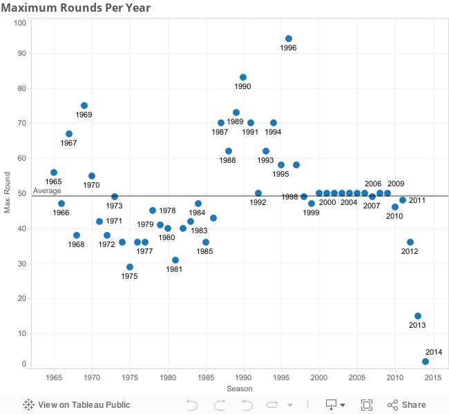
No draft was created equal. Teams used to not have a limit of how many rounds there were. As a result, this graph below is all over the place in terms of the lowest round a player was drafted from and made it to the majors. Up until 1998, this number varies greatly as some drafts went as low as the 92nd round, whereas others didn’t have anybody make the MLB beyond the 29th round.
The next graph shows the total WAR of players in their draft year.
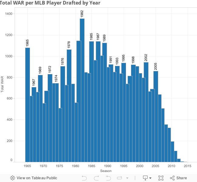
To reiterate, players like Roger Clemens and Barry Bonds were drafted twice so their WAR is calculated in two different seasons. Once again, this shows no draft is created equally. Superstars emerge at different times and this data doesn’t support that this made a difference in earlier and later years. The fun with this data is clicking on a year, and then checking out all the star players drafted. So 1982 seems like a power year for draft picks, right? Let’s see if this was a balanced draft or if a few players account for most of this WAR.
![]()
| Player | Signed | WAR |
| Barry Bonds | No | 164.45 |
| Randy Johnson | No | 110.56 |
| Rafael Palmeiro | No | 70.01 |
| Barry Larkin | No | 67.05 |
| David Wells | Yes | 58.2 |
| Dwight Gooden | Yes | 56.72 |
| Brett Saberhagen | Yes | 55.25 |
| Will Clark | No | 51.97 |
So this is a very strong group…that mostly never signed and would become a part of a later draft. A little bit of foreshadowing for what I’m going to write later, but those guys who didn’t sign were high schoolers who elected to go to college, meaning three years later, we may have the strongest draft class.
I was anticipating to see some patterns over time, but this was pretty random in terms of what years were ultimately successful, and which ones were not. So I decided to filter out some data in order to gauge what was one of the better drafts, which is kind of a loaded question since there are a lot of factors that could make a draft strong.
I guided this next graph by the Tom Brady draft principle I have thought about for some years. Should we credit New England for drafting Tom Brady, even if it was so late? I would argue they were pretty fortunate that he turned into the quarterback he has become. If New England knew he was going to be so good, why did they wait so long to draft him? Were they that confident that nobody else would take him? Or did they have him ranked relatively low compared to the rest of the draft? That is why for this next graph, I have only included first round picks. Those are the players that scouts and teams really thought were the best and were afraid would not fall to their next pick.
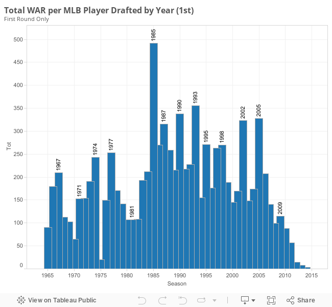
First thing I notice is that 1982 drops drastically, meaning there were some good picks later on, but I wouldn’t say that was a strong class. The 1985 first round is no joke. Look at this chart:
| Name | Total WAR |
| Barry Bonds | 164.4488 |
| Rafael Palmeiro | 70.01012 |
| Barry Larkin | 67.04872 |
| Will Clark | 51.96617 |
| B.J. Surhoff | 31.43287 |
| Bobby Witt | 27.81085 |
| Gregg Jefferies | 20.19373 |
| Walt Weiss | 14.82402 |
| Joe Magrane | 13.4609 |
| Brian McRae | 13.44958 |
| Pete Incaviglia | 10.16346 |
| Tommy Greene | 7.364726 |
| Willie Fraser | 0.44434 |
| Mike Campbell | -0.07739 |
| Mike Cook | -0.43798 |
| Randy Nosek | -0.5153 |
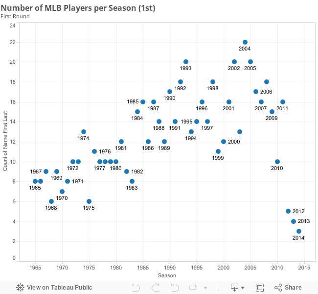
Sure, Barry Bonds has a huge impact on the total WAR for this draft. Even without Bonds, however, this first round would still rank in the tops. 16 players in 1985 made the majors, even if they barely contributed. That’s over half the picks, since there were no compensatory picks in those days. As time moves on, teams became better and had more opportunities to select players who would at least get a cup of coffee, as shown in the graph below:
Still, in context, 1985 stands out as a tremendous first round.
Speaking of the first round, the next graphs exist because of a question my uncle asked: would it be better to have every draft pick in the top 5 rounds or would it be better have every draft pick from rounds 6 and on? A quantity over quality question, in essence.
If you are on the quantity side, this next graph will suit your argument. This graph measures the average WAR of MLB players drafted in that round along with the amount of MLB players drafted.
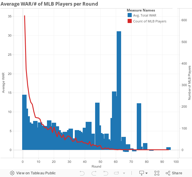
This looks encouraging for the sixth round and on argument since there are pretty significant averages later on in the draft. However, this is very misleading, since you are not often going to draft a Mike Piazza in the 62nd round (even a Ken Vining is better than expected in that spot). Again, Piazza is not being averaged against every 62nd round pick. He is only being averaged with him and the other player to make the MLB from the 62nd round (Ken Vining). If you have the greatest scout team of all time, you may elect to take the quantity approach and hope you find a slew of diamonds in the rough.
The following graph overwhelmingly supports the quality approach.
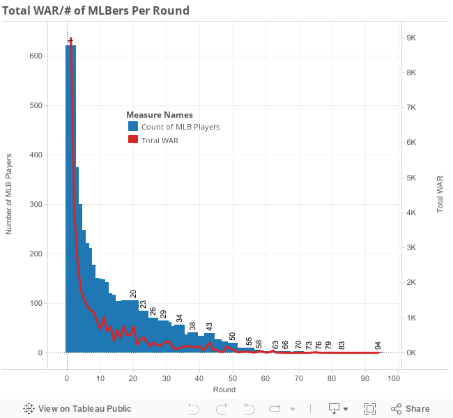
The first round alone has exponentially more value in terms of total WAR and players who made it to the MLB. Scouting has improved and teams are doing better at selecting quality high draft picks. The draft is still not an exact science, but the odds are better of finding top tier players, or at least serviceable players, in the first few rounds then later in the draft. No big surprise there.
In the next few weeks, I will continue to explore some draft trends. I plan on looking at how teams have drafted, colleges that have produced a large amount of MLB players, positional trends, some high school versus college player trends, and an in-depth look at some outlier data points. Please feel free to ask questions and bring up topics you would like to see in the comments section, and I will do what I can to provide a graph and analyze that particular issue.
Nice start! Some cool stuff in there. Looking forward to part 2.
This is fascinating.
This seems more like a FanGraphs article than RotoGraphs.
agreed , I actually scrolled up halfway through to check
it’s interesting but, hardly helps my fantasy teams 😛
Probably, though to those of us involved in super-deep dynasty leagues it definitely has some interest and potential value.
I see absolutely no value in adding players twice. Players tell teams bonus demands, or do not draft me, etc. all the time and teams take them late to either just retain their rights, do the player a favor to get them off the board, or want to have their name attached to their team knowing full well the chances they sign are virtually nil.
I also believe there should be buckets for where players were drafted within the rounds (mainly the 1st). You didn’t need to be especially keen on scouting to take A-Rod, Bryce Harper, Strasburg, and any number of other players who were taken in the top few picks.
Additionally, this should be broken up into the area they come from- high school or college.
It’s a nice start, but there is much work to be done here before the information becomes especially useful. Keep in mind, I mean this respectfully and appreciate the time it takes to compile the data.