Usually this early in the season, I would share the xwOBA under/overperformers. However, a suppressed or inflated BABIP has a dramatic impact on the gap between wOBA and xwOBA and since we remain in small sample size territory for the metric, I didn’t want to include a list of obvious names. We all assume a sub-.200 BABIP is going to rebound! Likewise, a .450 BABIP isn’t sustainable. So instead, let’s review ISO versus xISO.
Here are the latest playing time projection changes for position players since April 8th, highlighted by a couple of interesting prospects forcing their way to — or closer to — the majors.
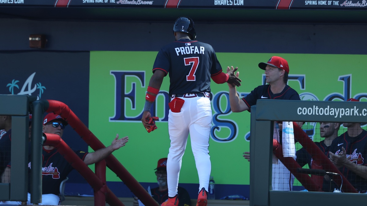
Here are the latest developments in position player playing time projections for the rest of the season. Now that the season is in full swing, we’re unfortunately seeing the injuries roll in, as well as a big PED suspension for Jurickson Profar.
While we remain in small sample territory, it’s always fun to look at the league leaders in various process-related rate metrics (though you can definitely go a layer deeper). Results are far less predictive right now, so let’s take a gander at which batters are leading in some of the statistics that we should actually care about right now, a least a little bit.
It’s hard to evaluate statistics this early without sounding the small sample size alarm bells. Yesterday, I looked at hitter bat speed, which supposedly conveys meaningful information after only a few swings, but still isn’t perfect this early. Today, I’ll look at another metric that works over small sample sizes, but only one side. That’s maxEV or the highest exit velocity a batter has hit a ball over a specified time period. We can evaluate the maxEV gainers already, but given that the metric could increase as the season progresses, it doesn’t make sense to review the fallers.
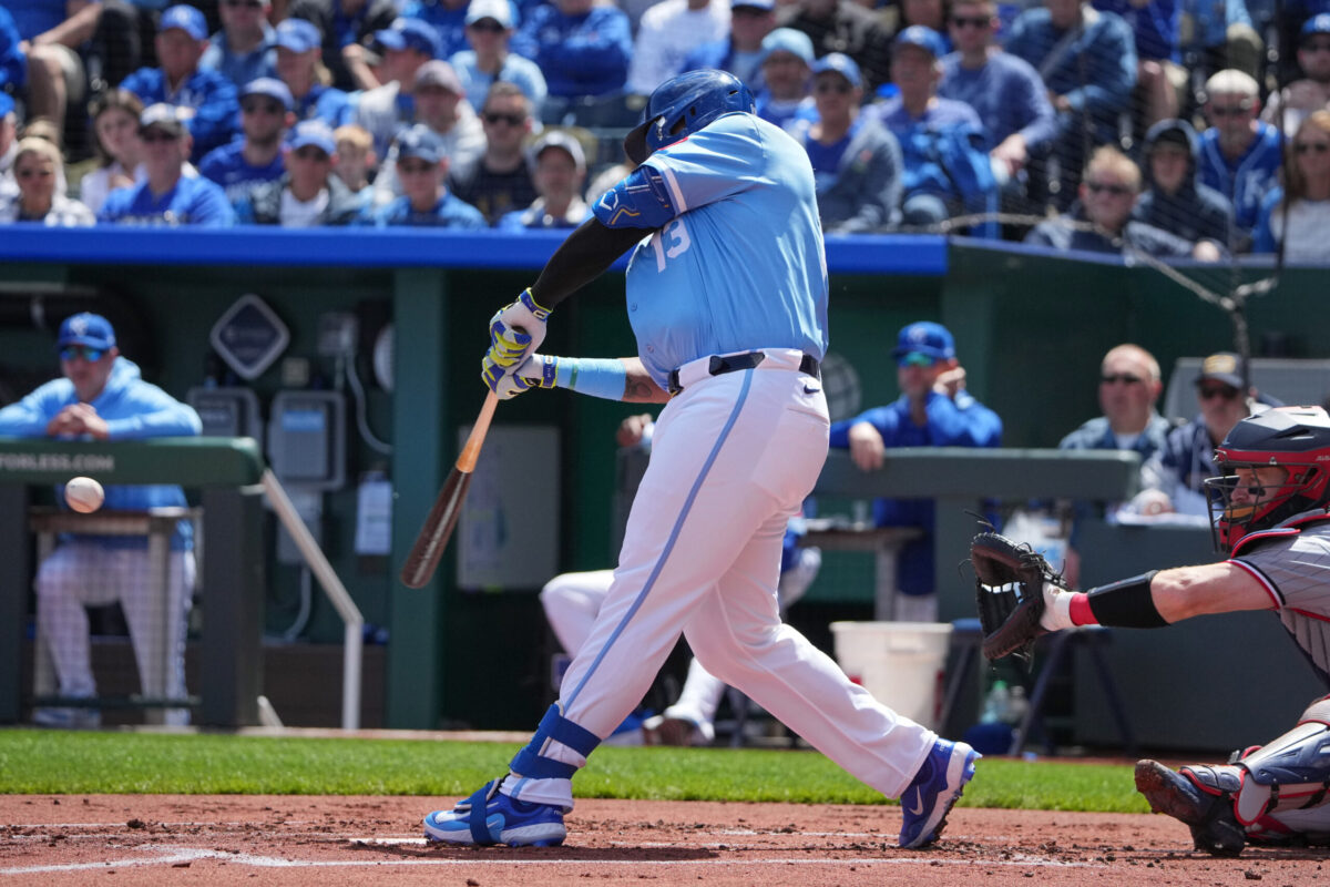
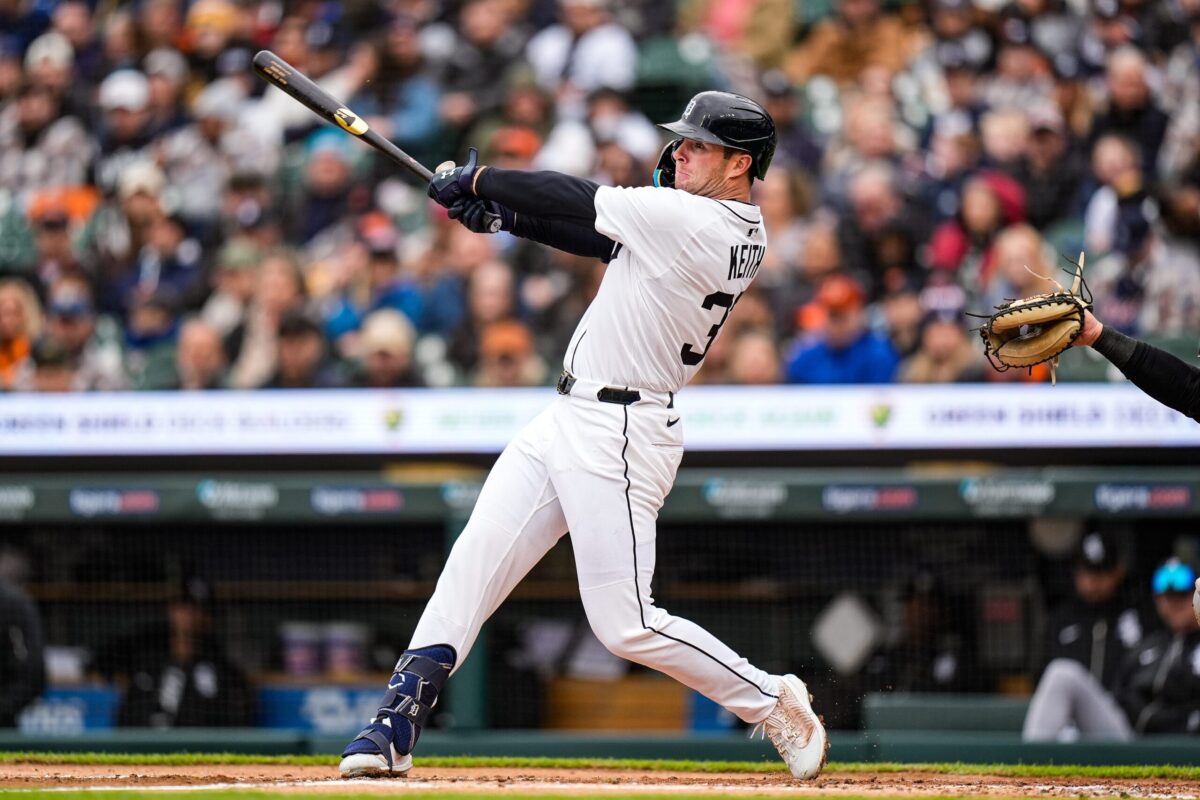
Welcome to the regular season, and welcome to the first in-season edition of Position Player Playing Time Changes! This will be very similar to the Spring Training editions, but with a change to go over.
During Spring Training, the changes had been shown in plate appearances, since every team had a full season to play, but it’ll now be displayed in percentage of remaining plate appearances. T are 700 plate appearances available to each player at the start of the season, but there are only 350 available when the player’s team has played 81 games, for example. So you and I both won’t have to constantly re-contextualize what remaining plate appearance means relative to games played, we’ll stick with percentages now.
To start the year, I’ll be using a cutoff of a 10% plate appearance swing in either direction, but that cutoff will go down as the season goes on (since 10% of 158 games is the same as 5% of 78). Occasionally, I’ll include players a little bit under the cutoff if they’re notable enough. Without further ado, let’s get to it:
Last year, the team at Baseball Savant blessed us with a cornucopia of new bat tracking metrics. One of those shiny new numbers was hitter average bat speed, which measures the speed at which a hitter swings. Last year, there was a robust 0.70 correlation between average bat speed and HR/FB rate among qualified hitters. That’s significant! Since average bat speed requires only a few swings to become predictive, it’s a great stat to monitor early on when small sample caveats apply to nearly every other metric. This might end up being a strong power breakout predictor before the power breakout actually occurs! On the flipside, perhaps a meaningful decline suggests disappointing output.