
PCA Outlier Hitters
Baseball collects a lot of data. It’s awesome. FanGraphs is a fun place for data. Exit velocity, spin rate, launch angle; these are fun data points. But, the vast majority of data that is floating around in lakes and clouds is generally not as exciting. Take some kind of machinery for example. Right now there are gears whirling, sensors sensing, detectors detecting, you get the point. This type of data is typically referenced in discussions about the internet of things (IoT). Baseball analytics has always benefited from what is learned in industry and in this post, I’ll be investigating whether a common industry technique, a Principal Component Analysis (PCA), can be useful in baseball analytics.
When data comes streaming in on a constant basis it can be difficult to analyze, let alone store, in traditional ways. Take for example a sensor in a delivery truck marking the workings of an engine part. The goal when analyzing this data is generally to detect an anomaly or a degradation so that mechanics can be alerted. Most likely, the truck doesn’t have one sensor, it has many, and all those data points are streaming in and getting compounded into a giant snowball of rows and columns. PCA is a technique that will take all that high-dimensional data and explain it in a simpler way, without compromising the data itself. What once was perhaps 1,000 columns of data can become two or three or four columns of data that still does a pretty good job of explaining the original 1,000.
Now, to the baseball!
Certainly, there are sensors in baseball. I’m sure bat sensors and swing sensors are collecting all kinds of biomechanical data that ends up floating around in some team cloud. I don’t have access to that. However, statcast data is not too far from streaming data. While it’s not collected all day, it does come in nearly every minute of a baseball game. If you’ve ever analyzed statcast data, you know that there’s a lot going on in the raw data. The goal of this process is to make finding outlier, or anomaly batted ball events, easier.
I’m only going to focus on three statcast data points; ‘hit_distance_sc’, ‘launch_speed’, and ‘launch_angle’. I’ve collected all statcast data from 2021 and I’m left with just less than 92,000 (with missing values removed) rows of data. Next, I’ll run the PCA to reduce these three columns down to just one. When I plot the resulting principal component against the observation number, we can start to see outliers:
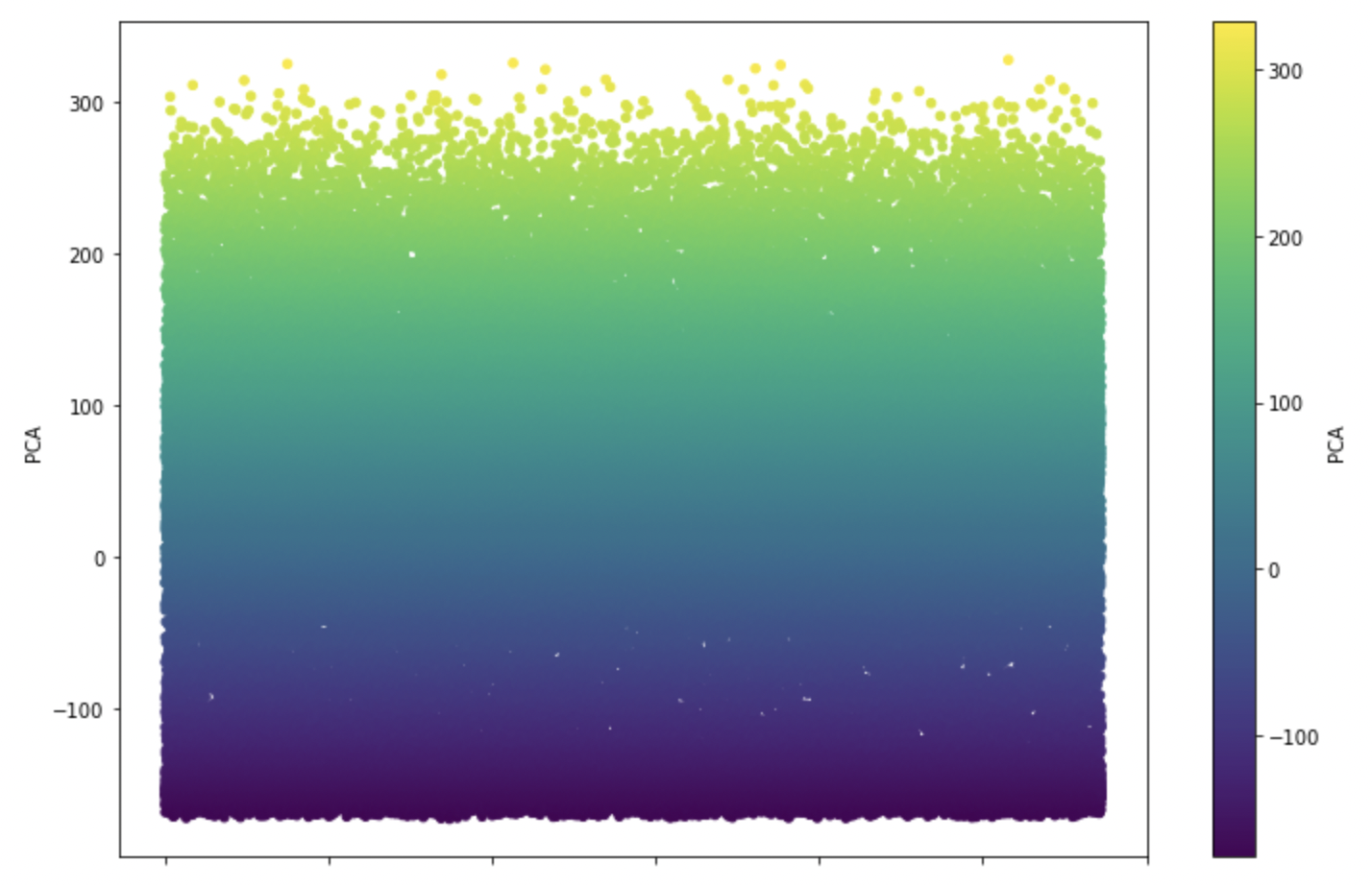
I’ve simply plotted the principal component against the event number in order to visualize the outliers. The x-axis really means nothing here, but look at the yellow data points at the top. These are batted ball events that I’m considering outliers, anything above 260. Here’s a quick look at the players with the most outliers in this analysis:
| Name | Number of Outlier Events | |
|---|---|---|
| 1 | Shohei Ohtani | 11 |
| 2 | Max Muncy | 10 |
| 3 | Matt Olson | 9 |
| 4 | Fernando Tatis Jr. | 9 |
| 5 | Tyler O’Neill | 9 |
| 6 | Ronald Acuña Jr. | 9 |
| 7 | Ryan McMahon | 9 |
| 8 | Kyle Seager | 9 |
| 9 | Rafael Devers | 9 |
| 10 | Vladimir Guerrero Jr. | 8 |
| 11 | Giancarlo Stanton | 8 |
| 12 | Freddie Freeman | 7 |
| 13 | Joey Gallo | 7 |
| 14 | Salvador Perez | 7 |
| 15 | Jesse Winker | 7 |
| 16 | José Abreu | 7 |
| 17 | Aaron Judge | 7 |
| 18 | Brandon Lowe | 7 |
| 19 | Randal Grichuk | 7 |
| 20 | Eugenio Suárez | 7 |
Here are a few examples of those events:
| Name | Hit Distance | Exit Velocity | Launch Angle | Principal Component |
|---|---|---|---|---|
| Nolan Arenado | 484.0 | 106.8 | 16.0 | 326 |
| Ronald Acuña Jr. | 481.0 | 111.9 | 27.0 | 325 |
| Marcell Ozuna | 479.0 | 114.3 | 25.0 | 323 |
| Ryan McMahon | 478.0 | 109.4 | 28.0 | 322 |
| Franchy Cordero | 474.0 | 118.6 | 29.0 | 319 |
Does this look like outlier behavior to you?
What about this?
The combination of these data points is consolidated into one, telling us who is standing out among the rest in batted ball events. Statcast data may not be IoT streaming data, but the analytical techniques that are used can be similar. Is there much use here for fantasy managers? Maybe. Outlier detection, in this case, is not much different than just sorting for max exit velocity on leaderboards and then keeping an eye on any new player that pops up. But, this process tells us just a little more than a one-column leaderboard sort does and a PCA can be conducted on any combination of metrics.
In reality, the technique that I’ve presented here may be better for detecting outliers of interest for MLB as a whole. I can’t really think of anything currently that MLB might be interested in detecting in large sets of data that could be useful for decision making, but maybe something will come up.
can you check this for Pete Crow Armstrong? what I’m saying is I want a PCA PCA
Does he hit in the Pacific Coast League? Then you’d have a PCL PCA PCA.
Of course the guy with the most outlier events is Shohei Ohtani, maybe the most outlier player in the entire history of baseball
Remember that time Babe Ruth hit more home runs than any other team?
Thank you for the article. It’s very intriguing to me, yet leaves me mildly frustrated because I feel that you teased an interesting approach without giving anything of substance (besides a simple table of some leading outlier players).
What I mean is, your second-to-last paragraph asks if this could be useful for fantasy managers and says, “this process tells us just a little more than a one-column leaderboard sort does and a PCA can be conducted on any combination of metrics. ” But there are no practical suggestions for those of us to who PCA is a new idea. I Googled it and it seems very complex.
So my question is: is PCA something an average fantasy manager with knowledge of Excel and a download of Statcast data could do? If so, some practical advice or resources would be helpful. If not (i.e, if you need to have significant data experience to do PCA) then why tease it like in this way with nothing actionable to be done and no suggestion of future articles with audience-ready analysis?
Like I said at the beginning, I appreciate your writing, but was left far more frustrated than satisfied.
Definitely understand your frustration. This is the first I’ve heard of it too, and it is somewhat complex. The key is the eigenvalues/eigenvectors. If you have Excel, there is no direct way to calculate these, but there are roundabout ways. It’s easier if you have something like Matlab or MathCAD,
The way this analysis is being used here doesn’t really give you much (if any) actionable information. It’s basically a fun examination of who hit the ball the hardest, highest, and longest all in one number. You could theoretically just add up the z values for EV, LA, and distance, but the reason he’s using PCA in this case is because EV and LA are more or less components of distance.
From what I understand, PCA is basically a way to take out the effect of one variable on another. For example, if you look at all the home runs hit this year, the covariance of EV and distance is 0.9, once you normalize each variable (i.e., comparing (distance-avg distance)/stdev(distance) to (EV-avgEV)/stdev(EV)). The max is 1, no relationship is 0, min is -1. Covariance of distance and LA, on the other hand, is -0.09 for HR, so nearly no relationship, and EV/LA relationship is -0.22, so some but not a lot. In fact, you can basically recreate the table of “leaders” by plugging in distance>=415, LA>=25 in the Statcast search.
Where I can see PCA being useful is for plate discipline numbers, since they often are related to one another. For example, maybe more swings is correlated with less contact, so you could “filter out” that relationship using PCA, which is an attempt to remove covariance from analyses.
Plate Discipline yes! I would love to read anything that furthers that information!
“I can’t really think of anything currently that MLB might be interested in detecting in large sets of data that could be useful for decision making, but maybe something will come up.”
I see what you did there. 😉