2015 Visualized: Starting Pitchers
2015 Visualized: Outfield
2015 Visualized: Shortstop
2015 Visualized: Third Base
2015 Visualized: Second Base
2015 Visualized: First Base
2015 Visualized: Catcher
* * *
As it has done for the past several weeks, the RotoGraphs staff will devote an entire week to a particular defensive position. After a three-week lull during which outfielders (and the hot stove) dominated our conversations, we will turn our collective attention to starting pitchers.
In past posts, I utilized Depth Charts projections, which combined two premier player projection systems (Steamer and ZiPS) while using playing times allocated by FanGraphs staff. However, I missed the boat on accessing pitcher Depth Chart projections from 2015. So, instead, I pulled them from Steamer’s website, on which they hosted a Google Doc of 2015’s preseason projections.
Using these projections, I compared projected xFIP (expected fielding independent pitching) to actual xFIP (1) by team and (2) by player within team. Because xFIP is a rate metric, I did not need to scale performances by playing time. I hope FanGraphs’ database split performances by starting and relieving because that’s what I asked it to do; if a pitcher who split time between the rotation and bullpen appears to have wonky numbers, it could be his splits, or it could be I’m an idiot.
First: the difference between each team’s xFIP generated by its starting pitchers and its projected xFIP. Blue represents the highest expected xFIP; yellow represents lowest expected xFIP. The size of the bar above (below) the line represents how many points better (worse) than expectations a team’s actual xFIP performed. Pitchers must have thrown at least 20 pitches in 2015 to be included in the data.
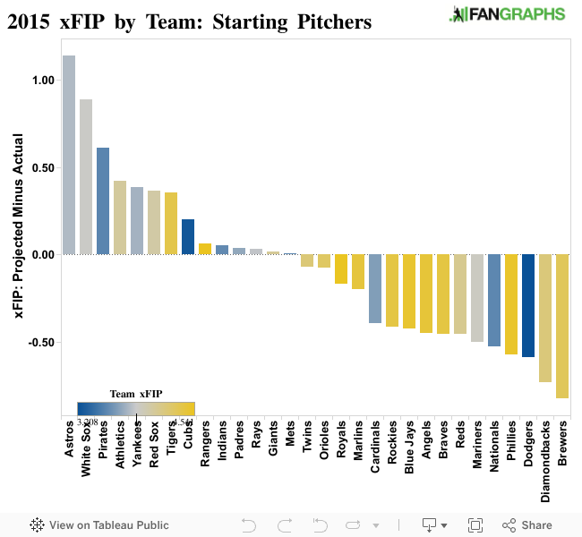
I’ll be transparent here: calculating xFIP using Steamer’s projections got a bit tricky. For example, I had to calculate projected xFIPs using what Steamer projected to be the league-average HR/FB rate (10.1%), which is a good deal lower than the actual HR/FB (11.6%). Moreover, unless the guys at Steamer respond to me on Twitter sometime soon, I won’t know what they used for their constant — a matter that could dramatically shift all the projected xFIPs. (It won’t, however, change how the teams rank, so what you see is what you get.) It would explain why their actual collective 4.02 xFIP greatly underperforms their projected collective 3.37 xFIP.
While I don’t think I made any fundamental mistakes calculating these numbers, it certainly seems like I did, especially when you look at the Dodgers’ projected xFIP as a team. I mean, 2.62? That sounds plausible for Clayton Kershaw and maybe former Dodger Zack Greinke, but an entire rotation? Don’t know about that one.
Anyway, second: the difference between each starting pitcher’s actual xFIP and his projected xFIP, categorized by team, represented by the distance of each dot from zero. Colors are scaled by actual xFIP, and dot magnitude represents sample size.
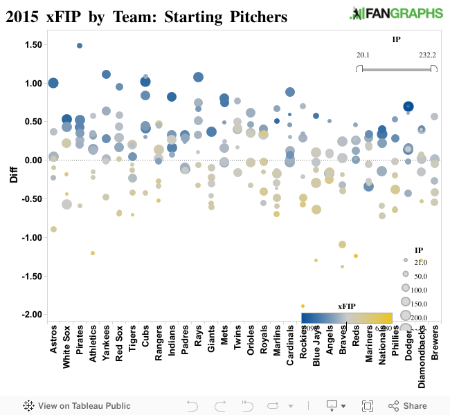
I’m kicking myself for not doing this earlier, but I guess it’s better late than never: I added a filter for innings pitched so you can interact more with the graph above. Tyler Matzek skewing the graph too much for you? (He’s currently hiding behind the xFIP legend. I don’t blame him.) Ramp that sucker up to a minimum of 23 innings pitched, and he’ll be gone.
In the past, I’ve focused on rookies and speculated on their past and future levels of success. I’ll stray from the path a bit and spotlight a few things that draw my attention.
My most analytical insight for this post: the Pirates generated one caterpillar of value in regard to beating each of their own projected xFIPs. I mean, just look at it! So cute.
Moving to the Red Sox: a team with a pretty awful rotation outside of Clay Buchholz managed, as individuals, to outperform each of their projected xFIPs by decent margins. Yet despite better-than-expected pitching peripherals, the team performed horrendously compared to what alleged “experts” expected them to do. David Price and Craig Kimbrel should help, but a team that has finished 9th of 15 AL teams in offensive value for two straight years should maybe focus on bats. Or maybe that’s just me. I don’t know.
Speaking of teams that outperformed: the Cubs’ rotation blew everyone away in 2015. And while that’s partly a matter of the projection systems not anticipating legitimate improvements to each pitcher’s game, it could also just be one of those things — those things, you know, kinda like luck, but kinda not — and a few of the rotation-mates will end up regressing in 2016. Still, after their offseason signings, you have to like their divisional odds.
The Indians are the only dang team without a single dang dot below the dang X-axis line. I have a big ol’ man crush on that entire rotation — even Josh Tomlin, who I thought would be underrated heading into 2015 and, despite not seeing playing a whole lot of rotation time, kind of was.
Regarding dots below the line, however — well, that recognition belongs to the Giants, among whom six old, name-brand pitchers locked a ball-and-chain to Madison Bumgarner’s ankles and threw away the key. Good thing the team added Jeff Samardzija to the mix; he only underperformed his projected xFIP by the largest margin of any pitcher who threw at least 175 innings and posted the 3rd-worst xFIP outright of 24 pitchers who threw at least 200 innings. (Hot on his heels: Shelby Miller, new and controversially-acquired Diamondback, whose 4.07 xFIP ranks 5th-worst among the group.)
Lastly, Greinke pretty much posted the exact peripherals Steamer expected him to. His actual performance, on the other hand, belies those metrics. I guess if you’re going to post a career year, do it in your walk year.
This is beautiful – great work!